Design Inspiration
Fall Palettes to Hang Instead of Orange
We love an orange and brown moment, truly. But in autumn, when the light grows low and golden and deeper colors start to glow on the walls, there are moodier and, frankly, more unexpected palettes to explore. So we went hunting for colors that say fall without leaning on the usual suspects. Here are five of them, and the art to help you channel them at home, with all the atmosphere and none of the pumpkin spice.
Plum and Olive
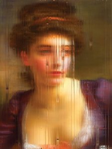
This pairing works with either color in front. Plum is the deep purple of a ripe fig, and olive is a green with a touch of yellow. Their contrasting undertones let them sit well next to each other.
Plum-heavy art is moodier and richer, while olive-heavy art feels earthier and a bit more relaxed. Both look at home in rooms with dark woods, vintage finds, and layered textiles, so they suit traditional and eclectic spaces especially well. We’d look for abstract landscapes and botanical paintings where these two melt into each other at the edges.
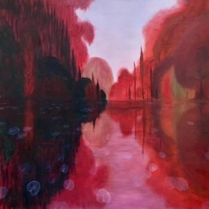
Onyx and Cranberry
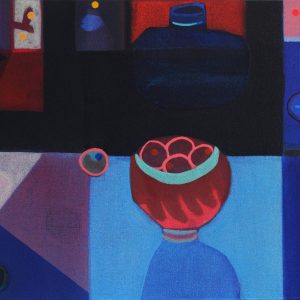
Cranberry is a deep, tart red with a little blue in it, and onyx is the glossy, deep black of a stone worn smooth. Look for paintings where red blooms, fruit, or foliage come out of a near-black ground, or where onyx pools at the edges of a cranberry field. Either color can lead. Onyx makes the red glow, and red keeps the black from going flat.
It’s a palette for evenings that start early. We love it in dining rooms, moody bedrooms, and anywhere with a lamp, a dark wall, or a little candlelight.
Powder Blue and Oxblood
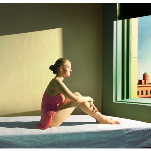
Start with the red. Oxblood is a dark red with brown underneath, the color of old leather. Beside a pale, chalky powder blue, the red deepens, and the blue gets cooler. The blue lets a room breathe, and the red gives your eye somewhere to settle. We love it in traditional rooms with natural wood, where the oxblood picks up the warmth of the furniture. We love it just as much in any space with pale walls that could use one deep, grounding note.
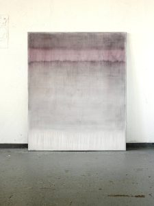
Dusty Rose and Pewter
Not every fall day is golden. Some are overcast and hushed, and this palette belongs to those. Dusty rose is the faded pink of an old petal, and pewter is a cool blue-gray with a soft shine. In abstracts and landscapes, the two blur together like fog burning off a field, or a pale pink glows quietly inside a field of gray. It’s a good fit for light rooms where you want a little fall without going dark.
Ultramarine and Ochre
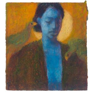
This one is all about proportion. Ultramarine is a deep, saturated blue with a little violet in it, the color of the sky just after the sun goes down. Ochre is a dusty, golden yellow, the color of dried grass. Look for night skies and abstracts where one small patch of ochre glows inside a field of ultramarine, like a lamp left on in a window across the street. Let the blue lead. A little ochre makes the whole painting feel lit from within, and too much starts to drift toward orange. We love this one in a cottage kitchen or a traditional office.
Before You Decide
Fall light doesn’t last long, which is a good reason to hang something that holds onto it. Choose the palette you’d happily stand in front of with a warm mug on a gray afternoon. Your room is a self-portrait, and it can change with the season.