Design Inspiration
Fresh Paint: Sherwin Williams Color of the Year
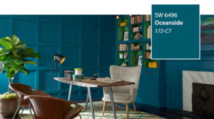
Sherwin Williams announced their 2018 color of the year: Oceanside. The bold hue is described as ‘a collision of rich blue and jewel-toned green, a color that is both accessible and elusive.’ While painting an entire room in a hue that is reminiscent of a versatile peacock blue may be daunting, we have a few suggestions on how to incorporate bold hues in your space.
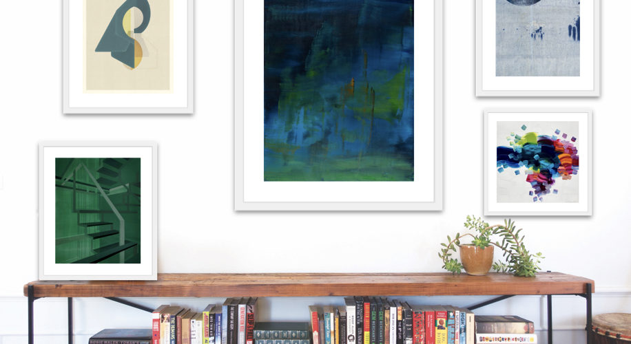
Create a themed gallery wall centered around color.
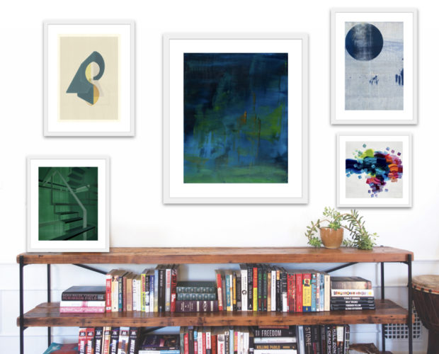
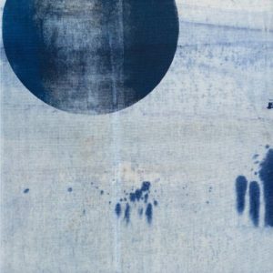
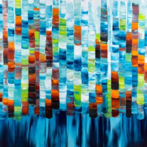
Create a gallery wall based on color and style. The artwork featured in the image above are framed limited edition abstract prints in various hues of blue and green.
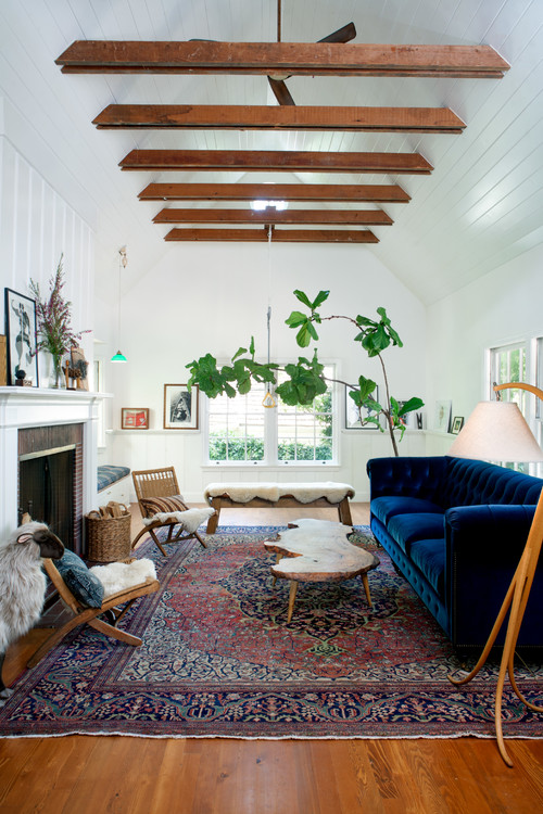
Go bold all the way.
Bold colors such as Oceanside or a vibrant velvet blue sofa, as pictured above, will instantly brighten any room. If the rest of your space features neutral color tones, accent and statement pieces will appear even more vibrant.
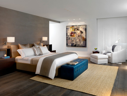
Create contrast with bold colors against a neutral palette.
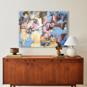
Let a colorful accent piece make a statement by contrasting it against a neutral color palette of other décor items.
Accessorize with color.
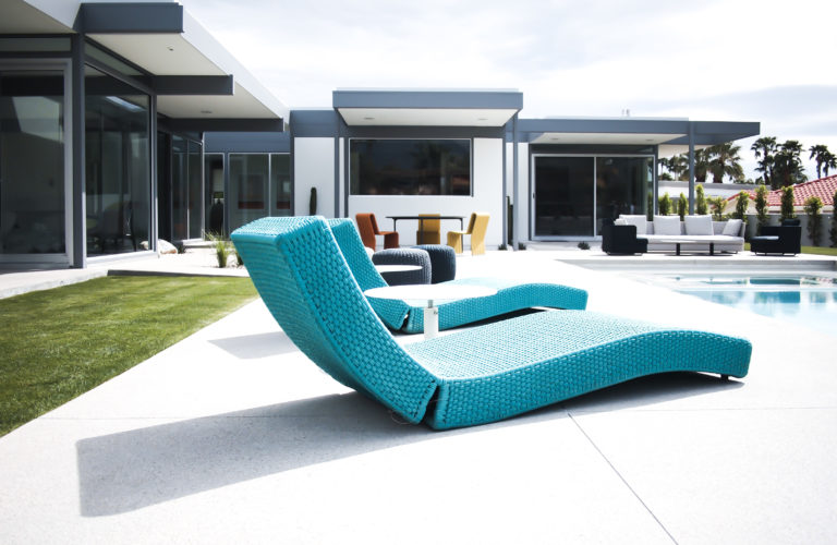
Ideal for the mid-century enthusiast, accessorize with colors that complement one another. A simple way to determine whether colors are complementary is by consulting a color wheel; colors opposite one another on a color wheel are complementary.
Love reading about all things art and design? You can have articles from Canvas, curated collections, and stories about emerging artists delivered straight to your inbox. Sign up for the Saatchi Art Newsletter.
