Design Inspiration
6 Design Ideas Inspired by Matisse
French artist Henri Matisse, known for his revolutionary use of brilliant color and expressive forms, sought to create work that would be “a soothing, calming influence on the mind, rather like a good armchair,” as he put it. His fearless use of color, pattern and movement transfer well to the world of interior design — so if you don’t have the millions to drop on an original Matisse masterpiece, consider letting the artist’s work inspire your decor instead. Here’s how.
1. Don’t be afraid of red.
Henri Matisse once said, “With color one obtains an energy that seems to stem from witchcraft.” Sorcery aside, a red palette can certainly be bewitching. Several of the artist’s paintings of interiors use red in abundance.
Red amps up the energy in a room and gets your heart beating. It’s an excellent choice for a dining or living room, as it stimulates social interaction. These lively walls are painted in a high-gloss Million Dollar Red by Benjamin Moore.
2. Embrace pattern pairings.
According to Matisse biographer Hilary Spurling, the artist came from a long line of weavers and spent his childhood around fabric, so textiles were in his blood. He amassed a sizable collection of fabrics, which he referred to as his “working library,” and apparently took fabric and Persian carpet swatches with him between studios.
Combining a bunch of bold patterns together might not be as difficult as it sounds. If Matisse pulled it off in his house, so can you. To get the right mix, follow a few simple rules.
Vary the scale. Piling a bunch of large-scale fabrics together will only make you dizzy. Balance large pattern with smaller portions of small- and medium-scale designs.
For example, the suzani throw on this sofa is a prominent piece with an equally bold design. The two throw pillows on the right side have a simpler, small-scale design that almost reads as textural. Meanwhile, the medium-scale floral pillows on the left serve as a good go-between.
Incorporate Bold Patterns With Pillows and Throws
Pick one main background color. Mixing too many colors together in a palette without a main color theme might make your room look busy and disorienting.
Allow for some breathing room. Going wild with an entire room full of mismatched patterns isn’t for the faint of heart. Most folks feel comfortable using bold patterns in small doses. If this is more your speed, make sure your spirited pattern is placed in a prominent location and doesn’t have competing pieces nearby.
3. Heighten focus with a true blue.
In 1912 and 1913, Matisse visited the Moroccan city of Tangiers. Inspired by the North African light and copious amounts of cobalt blue used in Moroccan interiors, he went on to celebrate the striking hue in many of his paintings.
Blue can be paradoxical. A light, watery, pale blue is widely known as relaxing and cooling, but the vividness of a brilliant blue like this one can be energizing. Bright blue can make you feel pleasantly caffeinated versus overly calm.
Because blue is also associated with clear thinking and focus, it’s a great color to use in a home office, sitting room or bedroom. This space is painted in Brilliant Blue by Olympic Paints.
4. Make room for a still life.
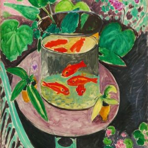
Matisse created numerous still life paintings of fruit, flowers, vases, guitars and even goldfish.
This kitchen might be a perfect modern-day Matisse setting. The wire basket filled with colorful apples makes an attractive and edible centerpiece. Swapping out different fruits, flowers and accessories celebrates nature and the passage of seasons. It’s also an easy way to add variety and elegance to your home.
Add a Basket to Your Kitchen’s Still Life
5. Add the art of movement.
In one of Matisse’s most famous paintings, La Danse, the composition of the girls’ encircled arms and twisting bodies add dynamism and excitement far beyond the rectangular shape of the canvas it’s painted on.
Here, images of actual dancers add a timeless touch and bring movement to an otherwise static space.
6. Consider cutouts. When Matisse’s health deteriorated later in life, he made collages using cutouts of gouache-painted paper. Many of his forms represent birds, marine life and vegetation.
To mimic the look, use fabrics and wallcoverings with designs that capture the graphic spirit of Matisse’s cutouts. This chair is upholstered in a fetching frond design from Raoul Fabrics.
Is Your Garden Cut Out for Matisse Inspiration?
Love reading about all things art? You can have articles from Canvas, curated collections and stories about emerging artists delivered straight to your inbox. Sign up for the Saatchi Art Newsletter.

