How-To
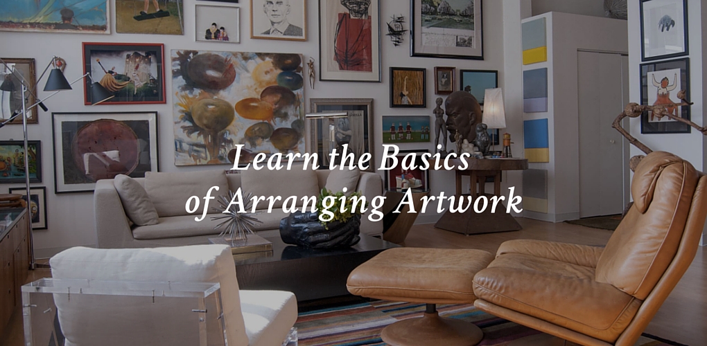
Learn the Basics of Arranging Artwork
Can’t wait to display that collection of pictures or artwork but stuck on how to hang it? Don’t feel bad. There’s a lot to consider in terms of symmetry, picture size and frame style. To get started, take a look at these eight different approaches to displaying your art and photos.
5 Ways Art Can Improve Your Room Design
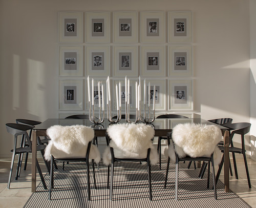
1. Linear
(Photo by Kenneth Brown Design. Image found on Houzz).
What it is: Pictures are hung in a line – either horizontally or vertically. This style emphasizes rhythm and balance.
Benefit: A linear configuration works especially well with pieces that are the same size and are framed with the exact same frame.
Size of wall space: When the artworks are hung horizontally, this is a good choice for a larger wall or to emphasize another horizontal element in the room, such as a rectilinear dining table or seating group.
Limitations: You’re limited by the wall width or height and the quantity of pieces you want to hang. If you have five pieces you want to hang this way but room for only four, this approach won’t work.
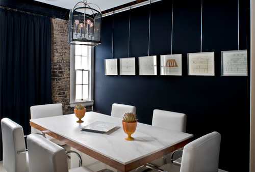
This dining room features a gallery-style hanging system to maintain uniformity and add an industrial edge.
While a linear style works for identically sized frames, it’s not imperative that the frames be the same size.
2. Grid
(Photo by D’Cruz Design Group Sydney Interior Designers. Original image found on Houzz).
What it is: Pictures are hung in precise rows and columns that emphasize order and symmetry.
Benefit: Similar to the linear approach, the grid configuration also lends itself to artworks of the same size and with the same frame. The grid method works especially well for collections with numerous pieces. A grid installation is particularly striking.
Size of wall space: The grid system is more flexible, as it works well for walls with little or a lot of wall area. You can hang pieces as high, low and wide as desired. Pieces can be hung either close together, as in this design, or farther apart.
Limitations: Like the linear system, architectural dimensions are a limitation. Also, you need to have enough pieces to create full rows and columns — no stragglers!
A grid installation may be tricky to hang because all of the frames must align exactly vertically and horizontally. It’s unlikely the back hanging wires will be the exact same length, so you’ll have to measure each individually.
3. Clustered
(Photo by accoutergroup. Original image found on Houzz).
What it is: A clustered configuration is freer; artworks are arranged within a loosely defined, more organic space. Although asymmetrical, a clustered configuration is still balanced.
Benefit: A clustered approach is ideal for artworks of various sizes and with various frame finishes. It’s also possible to add additional pieces without dismantling and rehanging the entire installation.
Size of wall space: With the clustered approach, you have complete freedom to use up an entire wall or just a portion of it. It depends on whether you’re trying to maximize your installation size or draw attention to a furniture piece.
Limitations: Besides architectural barriers and the wall size itself, this approach comes with perhaps the fewest limitations. However, you should try to maintain a fairly consistent distance between the frames. Otherwise it can look messy. Also try to strive for frames of similar thickness. A medley of thin frames mixed with one fat, curvaceous frame can be unsettling.
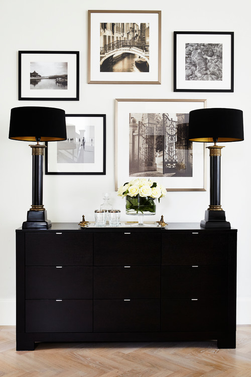
4. Salon-Style
(Photo by Katie Rosenfeld Design. Original image found on Houzz).
What it is: Salon style is truly old-school. Think of 18th-century Academic paintings on display at the Louvre. Salon style is characterized by a floor-to-ceiling wall-to-wall frenzy of artworks hung tightly together. The method has been gaining popularity lately.
Benefit: Salon style is romantically dramatic. Like the clustered style, it’s a good way to showcase pieces of art of different sizes and with different frame materials, especially if you have a sizable quantity of pieces. The framing materials define the space with hard, reflective surfaces, so this tends to make a room feel more closed-in. This isn’t a bad thing — think intimate and cozy.
Size of wall space: You can pull this approach off in small or large rooms, but it’s best used in spaces with high ceilings.
Limitations: Confirm your furniture placement before starting to lay out your configuration. That way you can work around furniture pieces. You don’t want to hang the entire wall and then realize a dining room chair back hits a painting or the sofa back doesn’t clear the bottom of a frame.
(Photo by Adrienne DeRosa. Original image found on Houzz.)
This salon-style installation is joyously full of life.
5. On Shelves
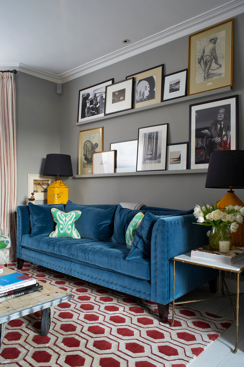
(Photo by Turner Pocock. Original image found on Houzz).
What it is: Pictures aren’t hung on the wall but leaned on an architectural feature, such as a shelf.
Benefit: If you like to change your artwork frequently, but aren’t handy with a hammer or have space constraints, this is a good choice. The shelf approach also offers an added opportunity to layer smaller frames in front of larger ones.
Size of wall space: Depending on whether you want a single shelf or multiple shelves stacked upon each other, you can pull this look off with a large or small wall.
Limitations: The size of your wall is a limitation in terms of the shelf size but, as mentioned above, this is a flexible approach allowing for moving and changing pieces. If you’re considering stacking shelves, you need to make sure the height of your largest picture on each shelf will fit.
6. Leaning Against a Wall
(Photo by Sarah Greenman. Original image found on Houzz).
What it is: Placing artwork on the floor and leaning it against the wall offers the same flexibility as the shelf approach. However, it does have a somewhat calculated sense of casualness.
Size of space: You need enough wall space and floor space clearance to accommodate the piece.
Benefit: No holes to drill or nails to hammer, and it’s a great option if you have a large piece of artwork and insufficient wall space to hang it. Leaning artwork is unusual and, like salon style, can be dramatic.
Limitations: If you’re clumsy or you have small children or pets, this is probably not the best route to choose. You need to be able to move the artwork to clean behind it. Leaning also tends to look strange with wall-to-wall carpet because it looks like you just moved in and are in limbo. Somehow, this scenario really looks good only with hardwood floors.
(Photo by Janel Holiday Interior Design. Original image found on Houzz).
If you like the leaned look but aren’t sold on the floor idea, place the art on a piece of furniture against the wall. Just make sure it’s nothing you use frequently and are liable to bump, like a make-up vanity or bar cart.
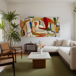
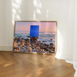
7. Singles Only
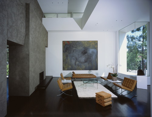
(Photo by Ehrlich Yanai Rhee Chaney Architects. Original image found on Houzz).
What it is: Hanging up a single large artwork.
Benefits: A single artwork creates a strong focal point or zone in a room. It’s also easier to hang one piece than align several pieces, such as in a grid arrangement.
Size of wall space: For a large artwork, you’ll need ample wall space — enough for the piece and breathing room around the perimeter so it doesn’t look cramped.
Limitations: You’ll need to take into consideration the weight of the artwork and how to anchor it into your wall material in the desired location. Logistics are tricky too — is this something you want (or are able) to tackle on your home stepladder, or do you need professional help?
Most large single artworks are centered either on a wall or in relationship to another component, such as above a fireplace.
8. Channel the Spirit of Your Artwork and Break All the Rules
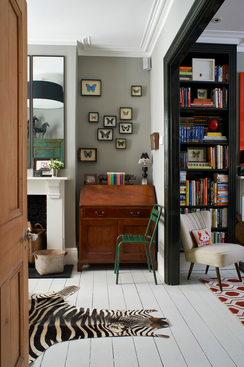
(Photo by Turner Pocock. Original image found on Houzz.)
You’ve gotta love this installation. Not only does it defy any attempt to be symmetrical, but it really pushes the envelope. Because of that, I find it delightful. The butterfly theme clearly helps this unconventional arrangement work, as if the butterflies are fluttering away before your eyes. However, without the right subject, this approach is hard to successfully achieve.
Love reading about all things art? You can have articles from Canvas, curated collections and stories about emerging artists delivered straight to your inbox. Sign up for the Saatchi Art Newsletter.

About the Author
Karen Egly-Thompson, Houzz Contributor. A former interior designer turned interiors writer, I have a mild obsession with tile, paint, quilts and rugs. I cover stories ranging from Houzz Tours to decorating ideas, but primarily focus on design materials.