Design Inspiration
8 Ways to Say Hello to Vermeer In Your Home
Even with only about three dozen paintings to his name, Johannes Vermeer is considered one of the greatest painters of the Dutch Golden Age. Painted with utmost care and the clarity of a photograph, Vermeer’s paintings mostly depict ordinary domestic scenes, often of ephemeral figures in the crisp northern light inside two rooms of his home in Delft, Netherlands.
Although you may think you and the 17th-century Dutch artist are worlds apart, you may be surprised to see how his paintings can shape your home’s interior for the better.
1. Install a stained glass window
In Vermeer’s day, stained glass windows were plentiful. Glass was expensive, so windows were made from small pieces of glass held together by lead strips. While stained glass is still made today, it’s often associated with religious buildings, or those small decorative artworks held in place by a suction cup.
A stained glass window isn’t just a beautiful piece of art, it’s functional as well. It adds pattern and color, and depending on the glass, it can provide privacy without blocking light.
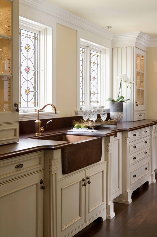
(Image: Photo by Venegas and Company, Courtesy of Houzz)
The stained glass windows in this kitchen are a beautiful focal point and help elevate the other traditional materials in the space.
2. Invest in an Oriental rug
Look at most any Vermeer (or 17th-century Dutch painting for that matter), and you’re likely to see an Oriental rug. Vermeer probably included them to demonstrate his talent in rendering all things intricate.
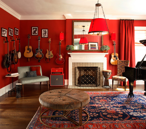
(Image: Photo by Chris Little Photography, Design by Dillard Pierce Design Associates, Courtesy of Houzz)
Like stained glass, Oriental rugs are prized works of art and will amp up any room. Patterns, colors, weaving techniques, and styles vary greatly. Some have larger, more prominent designs, like this example. Others are more elegant, finely detailed, and less pronounced.
If you don’t like the idea of walking on something so exquisite, hanging a rug on the wall is another way to enjoy its beauty.
Discover Thousands of Bold Oriental Rugs Here
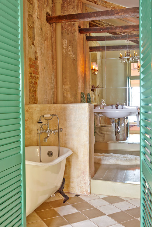
3. Checker your floor
Vermeer’s home clearly had checkered floors, and the plucky pattern also showed off his prowess in expressing perspective and depth in his paintings.
Prominent in 17th-century Holland, checkered floors have never gone out of style. Graphic and bold, they easily skirt between traditional and contemporary, and make a handsome statement.
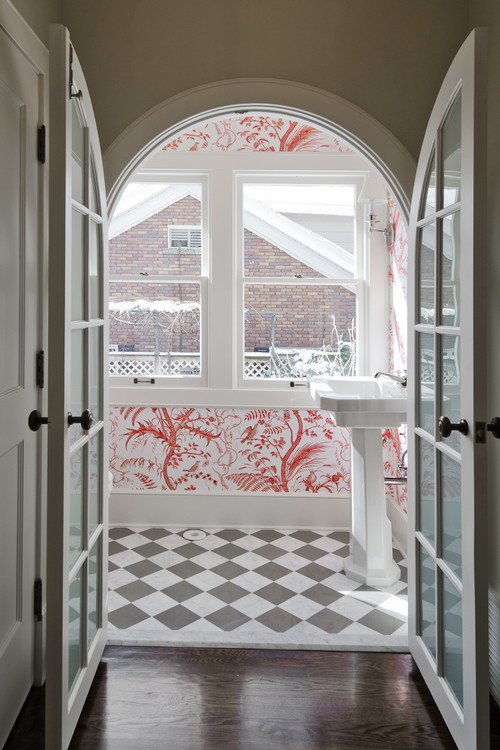
(Image: Photo by Cameo Homes Inc., Courtesy of Houzz)
Checkered floor patterns can vary in scale, but 12-inch squares set on a diagonal are the norm. Smaller squares can look overly busy if the palette is high-contrast like a black and white, but they can work in smallish spaces. This bathroom floor sports 6-inch marble tiles.
If you find checkered floors too adventurous for your taste, you can curb the graphic effect by installing a light border between the dark-valued tiles and selecting an accent color instead of black.
4. Embellish with a blue and white tile
The city of Delft is renowned for its blue and white pottery. An imitation of Chinese pieces imported by the Dutch East India Company, it’s also known as delftware. The pieces originally had tin glazing, which turned an opaque white when fired. Cobalt blue ceramic glazed patterns were added for decoration. Popular imagery includes windmills, flowers and pastoral figures.
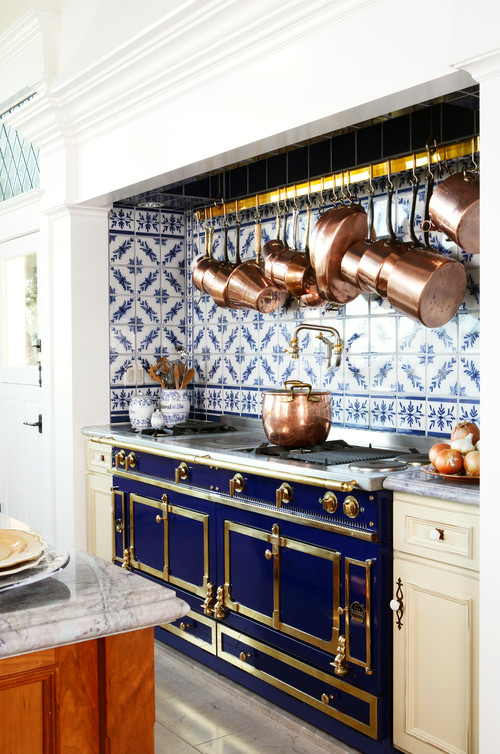
(Image:This kitchen uses delft tile as a full-height backsplash behind the cooking area. It’s a spectacular complement to copper pots too. Photo by J.P. Lindstrom., Inc, Courtesy of Houzz)
Unless you build a windmill on your property, probably nothing will evoke the aesthetic of the Low Countries more than delft tile.
Delft tiles are perfect for fireplace surrounds. Be aware that traditional Dutch tiles tend to be thicker and sized differently from U.S. factory-made tiles, so depending on your application, you’ll need to plan ahead to accommodate appropriate spacing.
Line Your Kitchen with Blue and White Delft Tile
5. Add drama with dark walls
Vermeer was a master of painting light. The contrast between his delicately lit subjects and dark backgrounds is dramatic and elegant.

(Image: Photo by Godrich Interiors, Courtesy of Houzz)
You can mimic Vermeer’s moody hues by painting your walls a dark hue. However, dark walls aren’t right for every space or aesthetic. Unlike whites, which are expansive and make a space feel larger, darks make a space feel smaller and more intimate.
Dark walls are a good choice for a room you want to make feel cozy, usually smaller spaces like a den or bedroom. In the bathroom shown here, it makes the sculptural sinks stand out.
6. Try out a blue and yellow room scheme
Despite living in financially delicate circumstances, Vermeer insisted on using the rarest and most expensive pigments, such as ultramarine blue, lead-tin yellow and vermilion red. Yellow and blue are the predominant colors in many of Vermeer’s paintings.

(Image: Photo by W Design Interiors, Courtesy of Houzz)
Blue and yellow go together remarkably well. While they’re not quite complements on the color wheel, they’re near cousins. Paired together, they create a pleasing energy that’s abuzz with nature tones.
Surround Your Fireplace with Vermeer-Inspired Designs
7. Map out your home
About half of Vermeer’s paintings show a large map on the wall. Jonathan Janson of The Vermeer Newsletter says maps were made for practical purposes, prestige, and home decoration. In Vermeer’s day, they were a cheap way to embellish bare walls and exhibit Dutch mercantile domination of world trade. Janson says the maps were generally glued on heavy cloth and hung on rods.
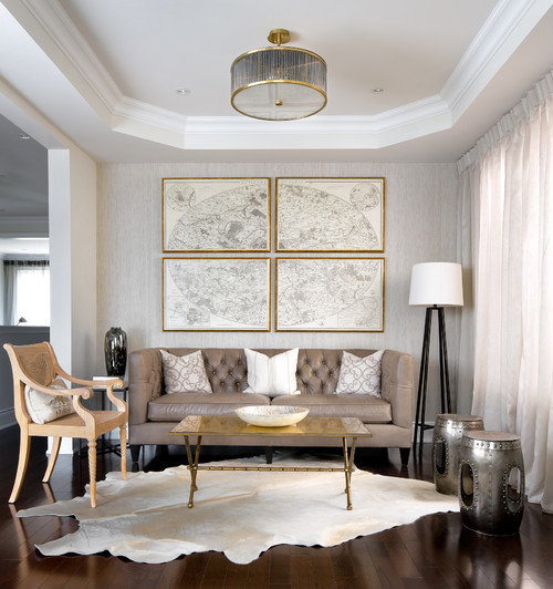
(Image:Today, maps are more likely to be framed than hung, but glass size can pose a logistical problem. If your map is too large to frame (and it isn’t of significant historical or financial worth), consider breaking it into sections. This large map of Paris is handsome framed in four pieces. Photo by Brandon Barre Photography, Design by Toronto Interior Design Group, Courtesy of Houzz)
Maps are a way to personalize your space with a location that holds special significance, like a hometown or favorite vacation spot.
Or go for an all-over look by installing map-themed wallpaper or actual nautical charts adhered to the walls.
8. Accept imperfection
Japanese culture has an aesthetic called wabi-sabi that’s focused on transience and imperfection. It’s unlikely Vermeer knew of this concept, but he hinted at it in his paintings.
(Image: Photo by Logan Killen Interiors, Courtesy of Houzz)
Although it isn’t advisable to put off the repair of crumbling building materials (you need to get to the heart of what’s causing the damage), there are instances when leaving things alone makes sense. Honoring old materials and celebrating how they change over time can be powerful.
These brick and stucco walls are nearly 200 years old and were uncovered during a renovation. Just as Vermeer didn’t edit out the wall damage in his painting, these designers didn’t want to cover up these walls with new material, but rather showcase their history instead. So they secured loose areas, and left the walls and wood beams exposed as they were.

About the Author
Karen Egly-Thompson, Houzz Contributor. A former interior designer turned interiors writer, I have a mild obsession with tile, paint, quilts and rugs. I cover stories ranging from Houzz Tours to decorating ideas, but primarily focus on design materials.