Design Inspiration
Double Take: How Did They Make That Mondrian-Inspired Wall?
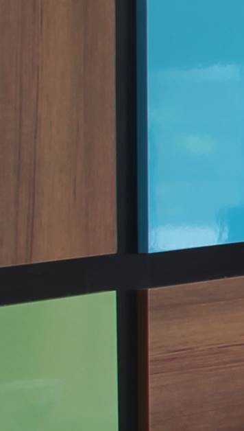
“I was just so happy that they went for it,” says interior designer Cynthia Prizant. Her clients, mid-century modern aficionados with two little girls, wanted to make a statement in their living room with a feature wall. Prizant had presented the Southern California homeowners with four options. The boldest option of the bunch was a mix of glossy and wood-grain laminate panels composed in a Mondrian-inspired arrangement.
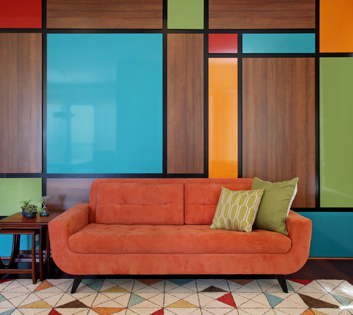
(Image: Photo by Jeri Koegel, Design by Cynthia Prizant – Prizant Design LLC, Courtesy of Houzz)
This room previously was dark and contained a behemoth of a brown sectional sofa, heavy draperies and no bright color at all. When Prizant first sat down with her clients, they had been browsing midcentury modern furniture for months, and they had their eye on this sofa, a chair upholstered in bright blue and a mid-century painting that gave Prizant an idea of which colors to use on the wall.
Light and Breezy Roman Window Shades
(Image: Photo by Becky Harris, Courtesy of Houzz)
“I wanted the panels to project out and be dimensional, and for the black lines in between them to recede,” Prizant says. The San Clemente, California, designer worked closely with her craftsman to make that happen.
“This was complicated, but my millworker, Brent Lindstrom, is amazing,” she says. The project could not have been completed without his precision and attention to detail. He built wood boxes and then used high heat and glue to wrap their fronts and sides in laminate. He then affixed them precisely into the composition using cleats so they would be secure. This method also avoided having a bunch of distracting screw holes.
Tracking down the colors she wanted in high-gloss laminate panels was no easy feat, but Prizant called several companies until she found them.
Laminate wall panels in Natural Teak, Grenadine high gloss and Leaf Green high gloss, all by Formica, and Ocean high gloss and Orange Grove high gloss by WilsonArt.
Colorful, Statement-Making Accent Chairs

(Image: Photo by Jeri Koegel, Design by Cynthia Prizant – Prizant Design LLC, Courtesy of Houzz)
To lighten up the room, Prizant removed heavy cornice boxes over the windows as well as the draperies, which opened up the views to the backyard and let in the sunlight. The light-colored Roman shades are embroidered with small colorful circles. “We kept them subtle because we already had so much color in here, but they still have the aspect of color in them,” she says.
Remarkably, Prizant found the geometric rug after she’d chosen the colors for the panels. The size she needed was sold out, but knowing it was hands down the best choice for the room, she ordered one that was too large and had it cut down.
The painting over the mid-century credenza was one of the original inspirations for the wall. “They wanted to keep this room open and not cluttered up by a lot of furniture so that their girls would have a place to play,” Prizant says. “The pattern in this rug takes care of filling out the space.” Not having a coffee table in here was a deliberate choice, and the credenza provides a place to stash the girls’ favorite toys.
Wall color: Milkweed, Dunn-Edwards; rug: Fantasy Triangles mod area rug, Liora Manne, Wayfair; window treatment fabric: Ball Game in Spice, Maxwell; Milo Baughman recliner: Design Within Reach
The Difference Between a Credenza and Buffet
