NFTs
 Paul Brouns
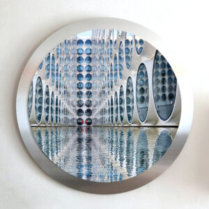
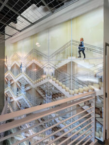
Paul Brouns is a Dutch photographer and graduate from the Academy of Fine Arts in Tilburg. Paul’s fascination with patterns, music scores, systems of writing, architecture, and other graphic structures makes itself known through his art. He uses camera and computer to create geometric lines, shapes, and rhythms in his photographic compositions.
Hi Paul, Have you always been drawn to shapes and patterns?
I first got hold of a camera at age 18 when I entered the academy as part of the first year’s curriculum. Initially I entered the academy with the intention to paint and draw.
I immediately was drawn towards framing geometrical shapes.
Music always has been a catalyst and important source of inspiration for me.
The concept of appreciating music also at some time helped me to fully learn to appreciate abstract art. There are a lot of parallels.
At that time (1985-1990) photography was still an analogue medium so all manipulation was done in the darkroom while printing and cutting up photographs. After graduation I was mainly painting and drawing, but I was already shooting patterns and architecture, just for capturing things I saw in the streets. Like a scrapbook to draw inspiration from for my paintings.
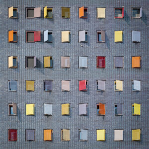
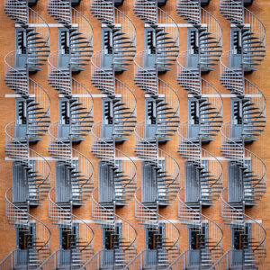
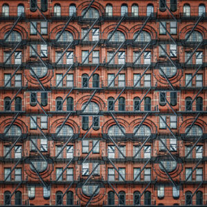
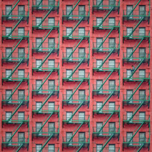
In my work I also look for a balance between abstraction of the composition and the lines and patterns on one side / recognizing personal details and getting some kind of perspective to relate to on a personal level. When I visited New York for instance I was more drawn towards the smaller appartment houses with those fire escapes and not so much to the sky scrapers. I always look for points of attention in the details. These massive towers of steel and glass may be impressive to look at but they don’t “touch me” enough to capture them for some reason.
How did you blend this personal approach with your geometric style when working on The Other Avatars?
It took a lot of trial and error to find an approach that worked for me. All of a sudden visualizing portraits was quite a challenge. Especially since I did not want to move away too far from my themes.
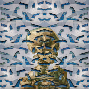
I decided to choose my type of works that is about frontal façades and play with the patterns within to reveal some of the portraits of VG.
I superimposed the paintings as a layer above the original photographs and in each one I looked for an approach to make them work together.
In some works I used the tiles or bricks of the building to work as a mosaic grid. That way, one recognizes the Van Gogh, especially in the thumbnail of the image. In other works, the painting comes through more strongly as a counterpart to the rhythm of the architecture.
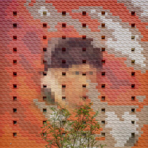
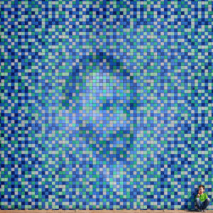
What went into the decision to add non-geometric elements, for example the casual observers or the trees?
Adding these references from the “real world” sometimes adds some extra perspective to relate to the size of a particular building.
All your work is in square form. Is there a reason behind this?
I have used the square format for a while because it is a self-imposed limitation that works very well for me. For some reason this format feels very natural for me. But I will definitely do series of works in other formats sometime in the future. Just like I also did with several commissions on location last year.
Love reading about all things art? You can have articles from Canvas, curated collections, and stories about emerging artists delivered straight to your inbox. Sign up for the Saatchi Art Newsletter.
