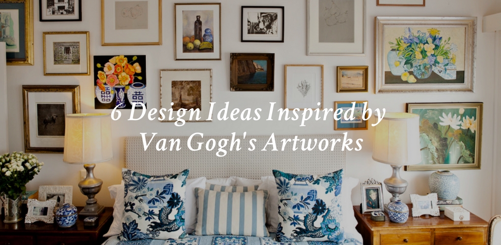
Design Inspiration
Six Interior Design Ideas Inspired by Van Gogh’s Artworks
Considered one of the most popular artists of all time, Vincent Van Gogh developed his own style characterized by bold, visible brushstrokes, heavily laden with bright paint. Although he sold only one painting in his lifetime, his emotionally charged, expressionistic work played a crucial in role in the development of modern art. His daring use of color and dreamy interpretation of the world are things that home interiors can benefit from too. So if you’re looking to energize your place, let the famous Dutch painter’s masterpieces guide you.
Read The 10 Most Inspiring Quotes from Van Gogh
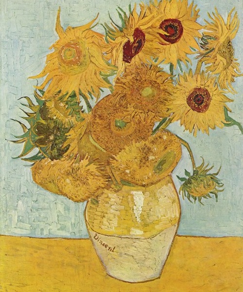
“Vase with 12 Sunflowers,” Van Gogh, 1888 (Image: Original photo on Houzz)
1. Use sunflowers to inject happiness.
It’s a no-brainer that flowers bring us joy. We give them as celebratory and thank-you gifts, tokens of affection or for no reason at all other than to just look at something beautiful.
Van Gogh painted seven paintings of sunflowers, and The National Gallery in London, which has many Van Gogh paintings, says the flower had special significance for the painter. Yellow for Van Gogh was a symbol of happiness. In fact, he once said, “How wonderful yellow is. It stands for the sun.”
Yellow is attention-grabbing and energetic, which is great for dreary climates, but too much can cause eye fatigue and feelings of aggression.
If you love sunflowers and the occasional seasonal bunch in a vase on your table isn’t enough, consider making them a permanent part of your home.
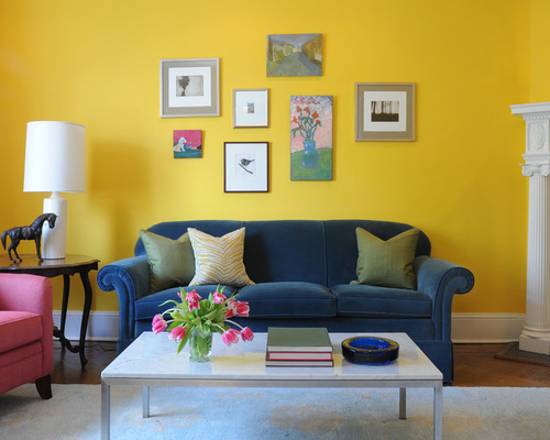
Bossy Color | Annie Elliott Interior Design, (Image: original photo on Houzz)
If a tile installation is too permanent for your comfort level, a cheery yellow paint offers a lot of punch with less commitment. Designer Annie Elliott used the appropriately named Sunrays by Benjamin Moore on the walls of this living room. Elliott also tempered the yellow’s impact with pinks, blues and greens in the artwork and furnishings.
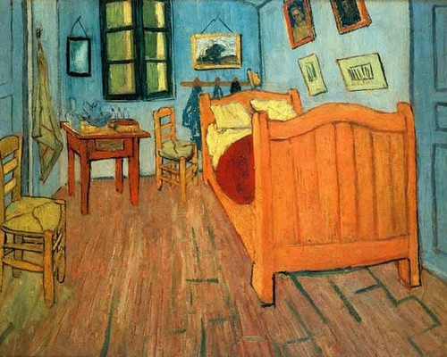
“Bedroom in Arles,” Van Gogh, 1888 (Image: Original photo on Houzz)
2. Mix different woods and stains.
Wood floors are an elegant feature in almost any home. However, don’t think that just because you have a medium stain on your oak floors, everything else in the room has to match.
Play around with a variety of wood species and stains in the same room. Unless you have a special installation that calls for uniformity, using one type of wood color throughout your space can make it feel bland and lifeless.
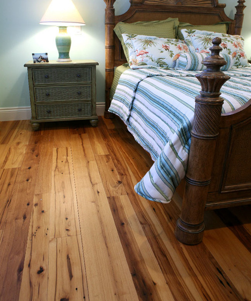
Olde Wood Ltd., (Image: original photo on Houzz)
In this bedroom, the hickory plank floor, which in itself has ribbons of darks and lights, contrasts beautifully with the richness of the darker antique bed frame. If the wood on the bed frame didn’t have a distinct value change compared with the floor, it would get lost.
Also consider using a colored glaze as a wood finish instead of a conventional stain. Unlike paint, a glaze adds a watery hue without obscuring the wood figuring underneath it.
Black & Spiro Interior Design, (Image: original photo on Houzz)
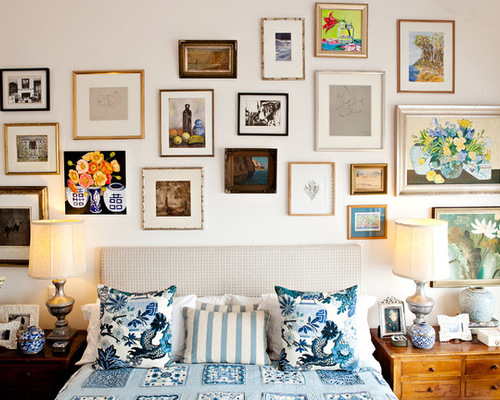
3. Create balance from imbalance.
Van Gogh’s Bedroom in Arles (shown previously) shows four pieces of artwork charmingly hung catawampus alongside the bed. Most folks have lone pieces of artwork that aren’t part of a same-sized, same-frame collection. Group pieces together to create a new union.
This bedroom wall is an assemblage of art. Before going to town with a hammer and nails, trace the perimeter of each piece in a contrasting paper and tape them on the wall to find the right composition. Consider the size of each piece and the spacing between them.
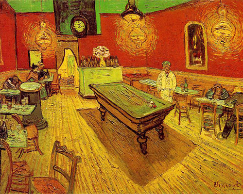
“The Night Cafe, Van Gogh, 1888” (Image: Original photo on Houzz)
4. Use a complementary color scheme.
Consider using two colors opposite each other on the color wheel. Touching on the theory that opposites attract, complementary colors bring out the best in each other — so they appear brighter than if they were used alongside a neutral or another hue. In The Night Cafe, Van Gogh uses a complementary scheme of red and green.
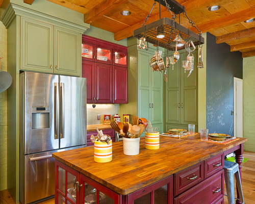
Arizona Designs Kitchens and Baths, (Image: original photo on Houzz)
Red and green are a particularly popular complementary pairing. Most people like both colors, which lean toward a warm, inviting traditional aesthetic.
This kitchen palette uses equal doses of red and green. Although this example doesn’t read Christmasy, using too much red and green with a lot of velvet and plaid may push the holiday look too much.
The complementary scheme of blue and orange usually has a more contemporary vibe, especially if the orange is vibrant. A yellow and purple complementary scheme is trickier to pull off. If too bright, it can easily look garish and unsettling.
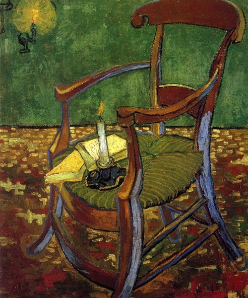
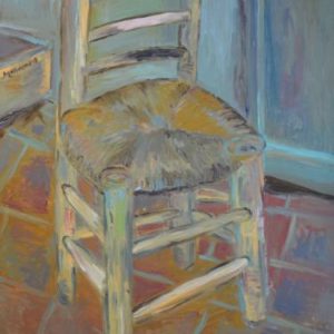
“Paul Gauguin’s Arm Chair,” Van Gogh, 1888 (Image: Original photo on Houzz)
5. Embrace your odd chairs.
Most everyone at one point has an odd armchair or two. Whether you inherit one or pick up a great find at a flea market, don’t think it needs to be paired with an identical twin or serve a dedicated purpose, unless you have a small space and can’t afford the square footage for superfluous seating. An odd chair looks terrific filling an unused corner or offering a spot in an entryway to sit and unlace boots.
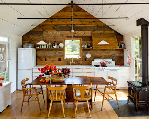
Jessica Helgerson Interior Design, (Image: original photo on Houzz)
If your oddball chair collection has grown, consider using them around a table, as in this example. Like complementary colors, the different forms enhance the chairs’ sculptural quality and the variations among them. Together, their individuality makes them more pleasant and interesting to look at than if all the chairs matched.
6. Mimic the stars.
A favorite painting of many people, The Starry Night shows Van Gogh’s rendition of a night sky full of the swirling, frenzied movement of stars, light and clouds. The artist was even quoted as saying, “For my part I know nothing with any certainty, but the sight of the stars makes me dream.”
With so much of our lives spent under artificial lighting, we miss out on a lot of the nuances not only of the beauty of an unadulterated night sky, but also of the slowed-down pace that seems to happen in low light. Van Gogh teaches us to reflect and take note.
‘Starry Night’ Inspires a Formal Living Room Design
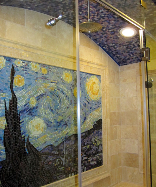
Chris Long Custom Works, (Image: original photo on Houzz)
This mosaic shower installation in Indiana pays a more direct homage to Van Gogh’s starry masterpiece.
A simpler approach to achieve the scintillating effect of starlight is to get out the forgotten stash of votive candles you likely are saving for company or some supposed special occasion. Celebrate your day with candlelight. It will make the end of a good day even better, and a bad one not seem so grim.

About the Author
Karen Egly-Thompson, Houzz Contributor. A former interior designer turned interiors writer, I have a mild obsession with tile, paint, quilts and rugs. I cover stories ranging from Houzz Tours to decorating ideas, but primarily focus on design materials.