Design Inspiration
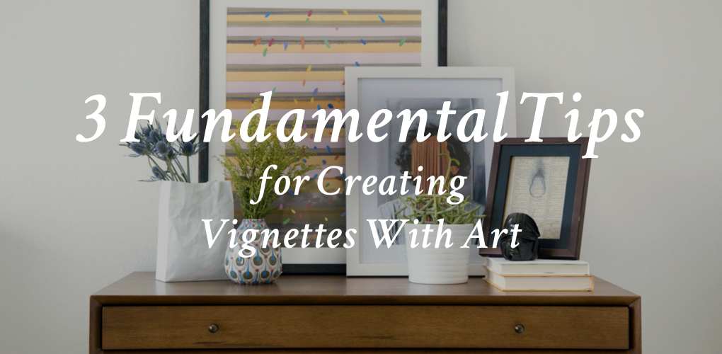
3 Fundamental Tips for Creating Vignettes With Art
Vignettes offer a host of creative possibilities for displaying your best-loved artwork, art prints, and collectables. Rearranging your favorite art, books and plants offers a chance to appreciate them again in a new way, and is an uncomplicated way to update your interiors in an afternoon. Here are three things to think about to help you get started.
1… Mixing art and decorative objects of various heights makes the most impact.
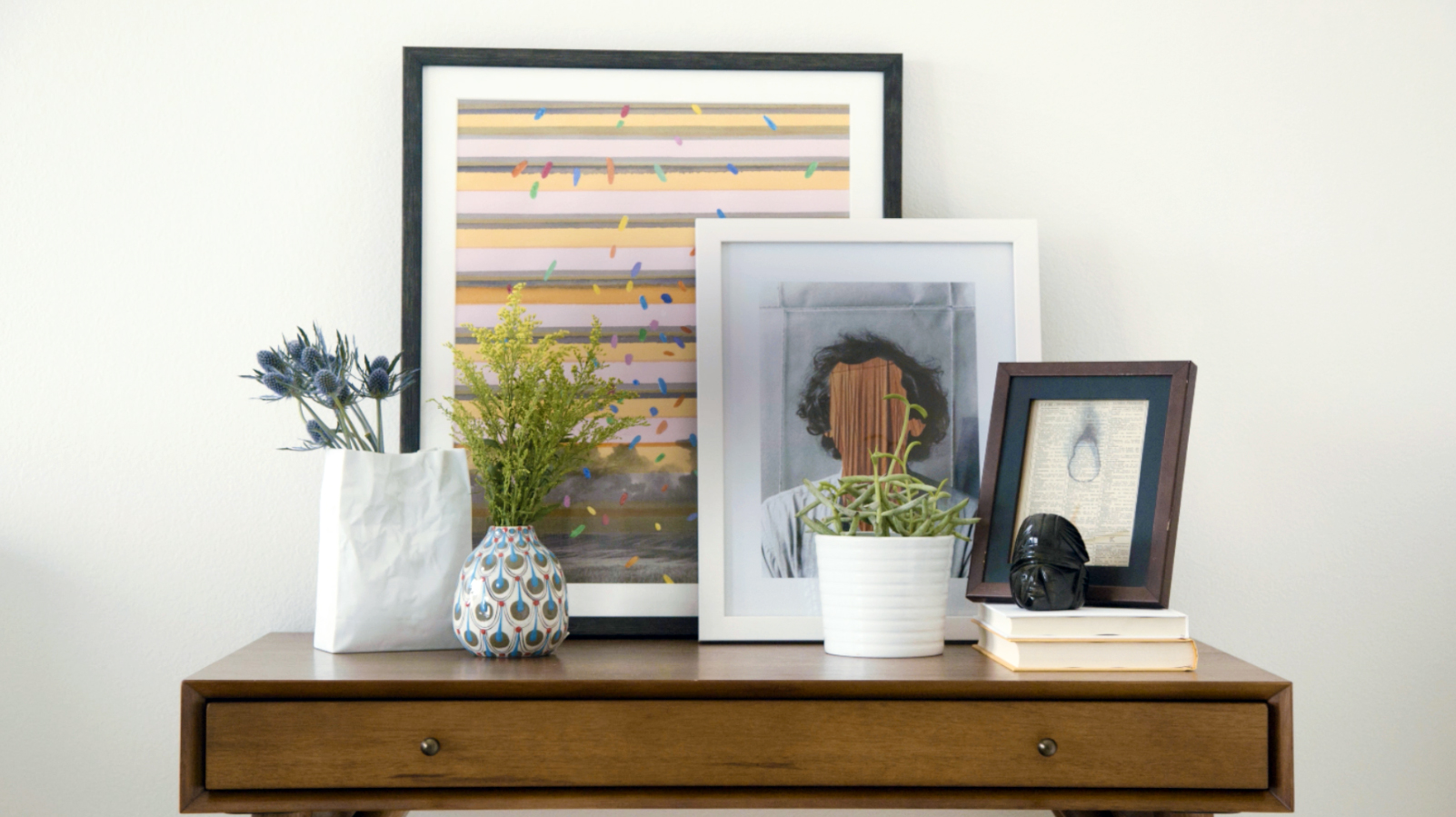
These casual vignettes were created using art by Saatchi Art artists. (Image: Saatchi Art /Artwork by Saatchi Art artists Roberto Voorbij and Oksana Reznik. Small print by Coco de Paris.)
Don’t be afraid to layer smaller works of art over larger ones, especially if there is contrast in color or framing that helps things stand out. Layering artwork and objects creates depth. Houzz also notes the importance of using height to balance your arrangements:
“Several objects of similar height or color placed at one end of a table or bench create an unbalanced look. A lopsided placement needs variety within it and visual connection to the rest of the surface. Balance it with a tall central object, such as a painting or sketch…”
2… Using the right lighting accentuates your arrangements.
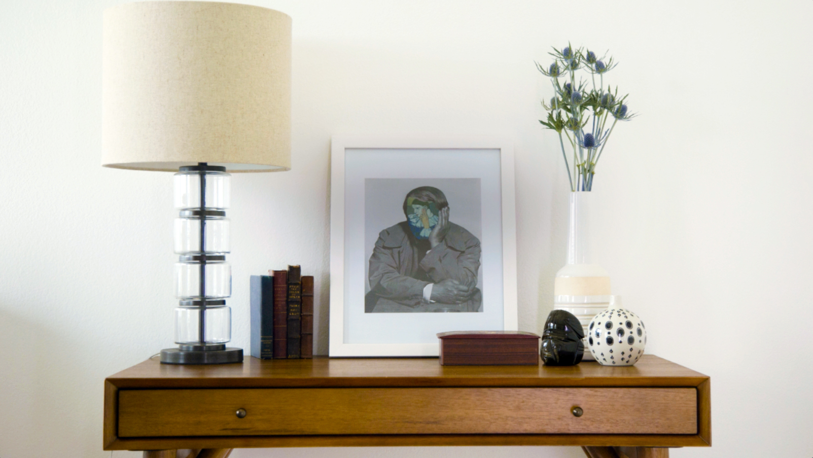
Think of your vignette as a mini-museum, and make sure there’s sufficient lighting to help your artwork shine. Placing a mirror behind your arrangement is an effective way to add light, interest and depth, too. (Image: Saatchi Art / Artwork by Saatchi Art artist Roberto Voorbij )
3… Combining diverse textures, shapes, and colors keeps things exciting.
Including small sculptural plants is an easy way to add interesting shapes, contrasting natural textures, and a dash of living color to your tabletop art displays. When designing your vignettes, Apartment Therapy recommends “displaying objects in odd numbers” to keep things from feeling too rigid, and notes that “Groups of three or five work particularly well and are stronger visually than a group of two or four.”
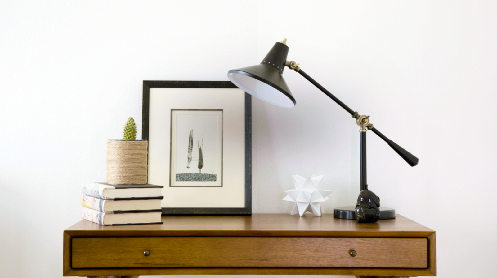
Balance your vignette by placing a tall object or artwork in the center and building around it. Displaying odd numbers or items generates visual interest. (Image: Saatchi Art / Artwork by Saatchi Art artist Heather Goodwind)
In the market for fresh art to finesse your vignettes? Visit our latest Small is Beautiful Collection today.
