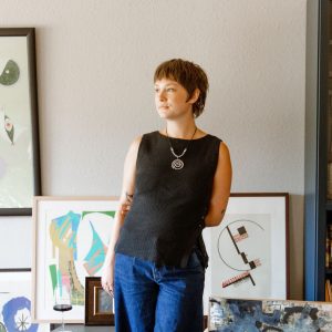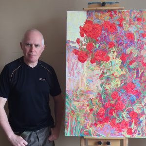
One to Watch
 Archie Proudfoot’s artworks examine the semiotics of language and its destination
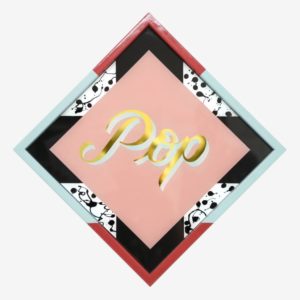
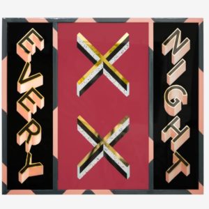
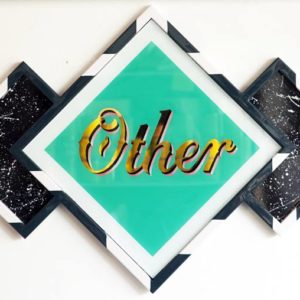
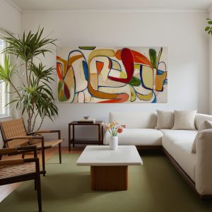
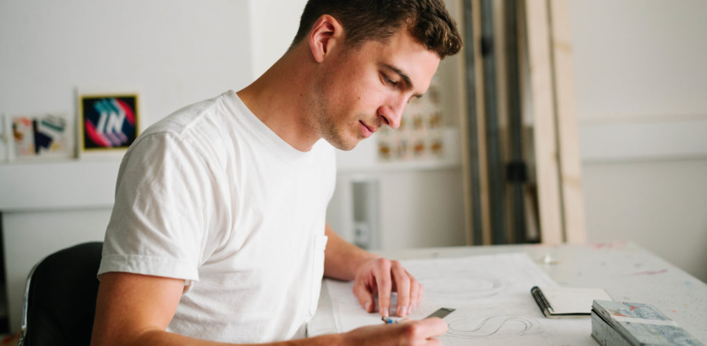
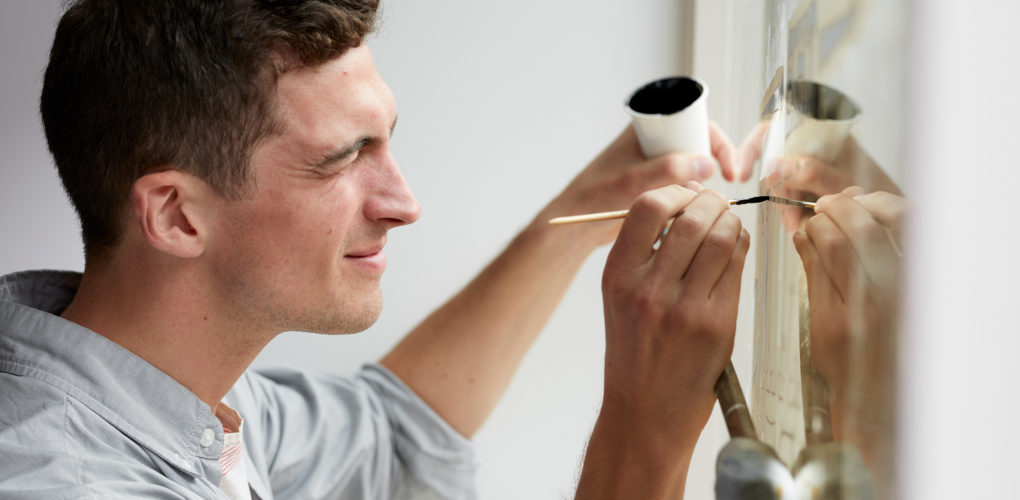
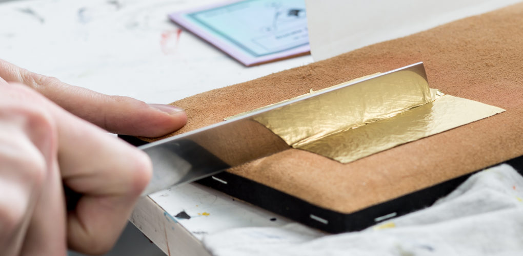
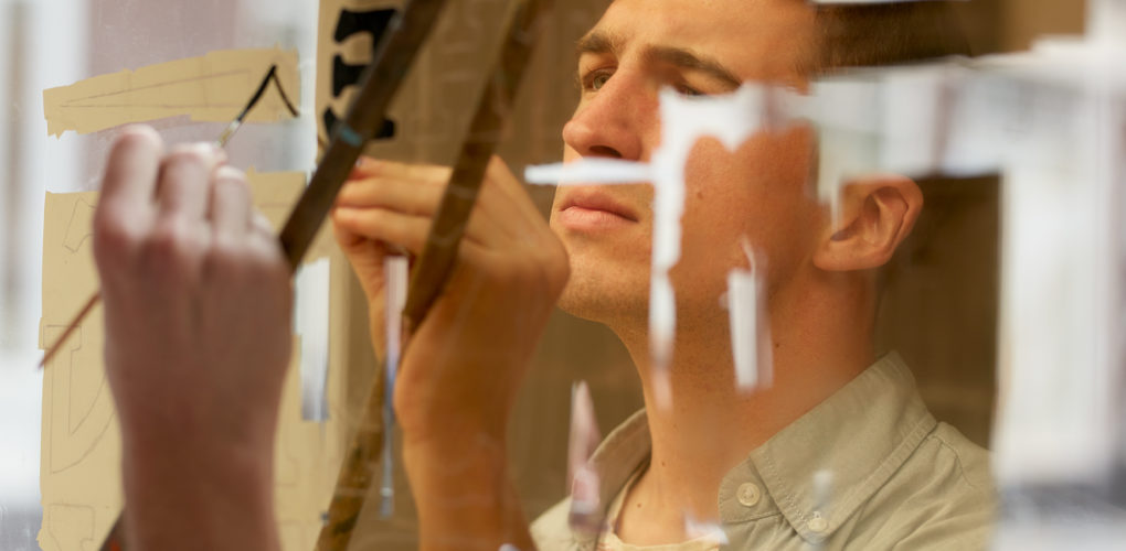
Archie Proudfoot’s works are about the power of language. An artist and bespoke sign painter, he works with traditional sign painting techniques, beginning with a sketch, followed by the application of 23-carat gold leaf and hardened enamel paint. He typically focuses on a single word or phrase, isolating it from its wider context to see what kind of emotional response it elicits in viewers. The design and color choices for a given work are, in turn, his own response to these fragmented phrases.
Archie has a degree in English Literature, a study which informs his practice. He divides his time between producing his personal tyopgraphic works and creating bespoke signage for businesses across London. He worked with Virgin V Festival in 2017, developing a colorful bespoke typeface for the event. Archie has exhibited his works at The Other Art Fair, The London Art Fair, The Affordable Art Fair, and Clerkenwell Design Week.
What are the major themes you pursue in your work?
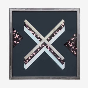
With my signage pieces I like to explore how language works when it is fixed and reified in the grandeur of the gold leaf and glass. By isolating a word or two, you can examine your emotional response to it, what memories and associations it conjures up. The design and color choices that make up these pieces are my own response to these fragments of language that I choose to make into work. I love seeing how people’s responses reflect or differ from my own when they view these pieces.
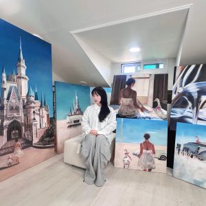
Recently my work has focused more specifically on a creating a visual response to the viewing of a found image. Like with my typographic work, where I start with a word and then make a visual representation of it, I start with an image and rework it either applying color and pattern or by incorporating it into a collage.
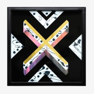
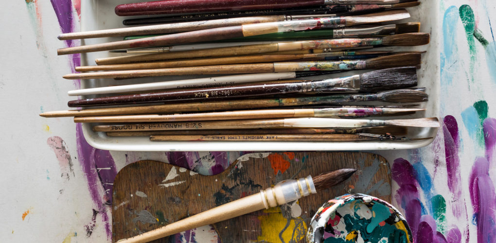
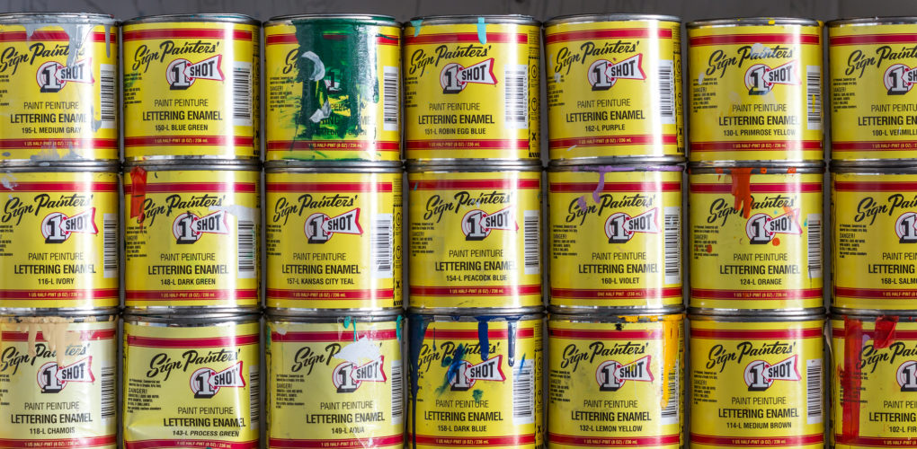
The visceral experience of color and the quality of paint is central in all of my work. I love to use rich, pigment heavy enamel paint that is usually used for sign painting. The interaction of the different textures that I apply this paint to in my work, glass, steel and c-type prints, is something that I really enjoy exploring.
How did you first get interested in your medium, and what draws you to it specifically?
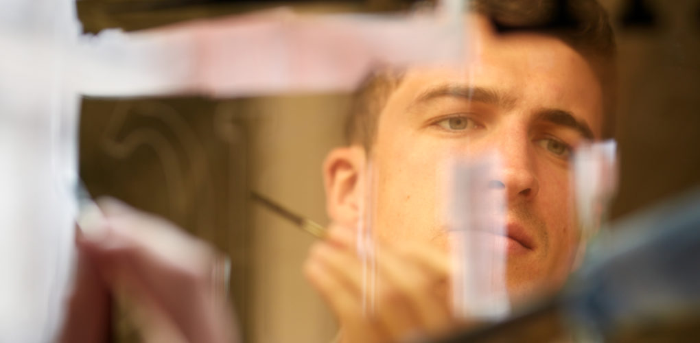
I became interested in the almost extinct trade of traditional sign painting a few years ago. When I first saw the laying out and painting of lettering by hand it had a beautiful freedom of expression to it that instantly had me hooked. I began teaching myself the techniques and eventually I was able to paint signage for shops and businesses, a job I still do today. I love the reverential feel that these grandiose lettering styles of the tradition can give to words, so I began exploring using them in artwork rather than in a purely functional way and that’s led me down the path I’m on today.
How has your style and practice changed over the years?
When I first started making this kind of work it was very clear and graphic in its style. Over time I’ve gradually incorporated more texture, pattern and irregularity. This has been driven by changes in my practice and exploring new techniques. When I learnt to weld steel frames for my glass pieces it opened up a whole new world of possibilities in the way I could present my work. Now, after beginning to explore a broader range of mark making and collage, my style had become much looser and expressive. I still have that clean graphic feel in a lot of my work, but now I have a wider arsenal of approaches when I come to make new pieces.
Can you walk us through your process? Do you begin with a sketch, or do you just jump in? How long do you spend on one work? How do you know when it is finished?
For my reverse-glass typographic pieces I generally start with a sketch that then gets worked up to a refined scale size pattern that is the roadmap for the piece. It’s then a case in laying loose-leaf gold in a process called water gilding. I continue to work, stage by stage in the reverse until the glass is filled. They can take from a couple of days to a week to complete. One of the benefits of working on the reverse of glass is that once the glass is filled its finished, there’s no changing your mind and painting over things endlessly!
Who are some of your favorite artists, and why?
I generally look a lot at American post war artists, people like Rauschenberg, Frank Stella and Ed Ruscha. The way they use color, shape and imagery to create the different tones in their work is what I especially look at.
What are some of your favorite experiences as an artist?
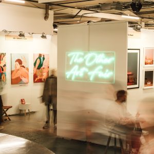
I think selling work for the first time was such an important experience. I was exhibiting at The Other Art Fair for the first time and I had no idea how my work would be received, I sold my favorite piece on display at the private view to the wonderful Laura Lea, a collector and gallerist I still work with today. There’s nothing quite like experiencing that rush that comes with a sale!
About the Author
Jessica McQueen is Associate Curator at Saatchi Art. Need help finding art? Contact her via our free Art Advisory service at saatchiart.com/artadvisory.