Design Inspiration
Art, Color Psychology, and the Rooms We Live In
Color psychology is the science of how our nervous systems respond to colors. Think how blue slows a heart rate, terracotta brings warmth even in a north-facing room, or an expanse of white can feel either liberating or cold. When you know how color shapes the way a room feels, every decorating decision gets easier. Discover original art chosen to work with your space and mood.
What the Research Tells Us About Color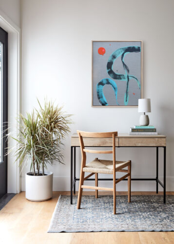
Color psychology has been studied in hospitals, retail environments, restaurants, and classrooms— anywhere that human behavior and emotion intersect with designed space. The patterns that have emerged are clear. Color dictates how we feel physically, mentally, and emotionally.
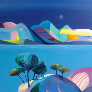
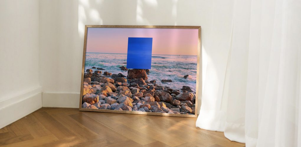
Blues and indigo lower heart rate and cortisol. They create calm, openness, and focus—which is why they fit so well in bedrooms, home offices, and bathrooms. These are the colors of space and sky, and they make rooms feel larger and quieter.
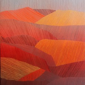
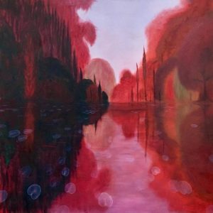
Red, yellow, and orange do the opposite. They make people feel physically warmer—studies suggest by as much as 2–3 degrees. They also slightly raise arousal levels, lowering inhibition and stimulating appetite. The result is rooms that feel more social which is why these tones belong in the spaces where people actually gather
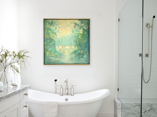
Green is the easiest color for the eye to process, sitting in the middle of the visible spectrum and requiring almost no muscular adjustment to focus on. Our nervous systems are wired to read green as a signal of safe, resource-rich environments. Exposure to green measurably reduces cortisol, which is the physiological basis of biophilic design—the principle that connecting people to nature, even through color and materials, directly improves wellbeing.
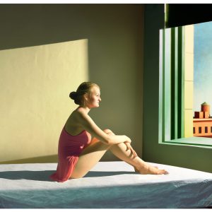
Pinks and blush tones at lower saturations are softening and mood-lifting. They add warmth without the aggression of red, and introduce a sense of ease in spaces that might otherwise feel too spare or austere.
Purple doesn’t have the same body of physiological research behind it as blue or green. What it does have is something more persistent: across cultures and centuries, it has been the color most consistently associated with contemplation, introspection, and interior life.
Warm neutrals—taupes, creams, soft whites—reduce visual stimulation, lowering cognitive load and creating a physical sense of ease. Less for the eye to process means less for the nervous system to do.
Art as the Anchor
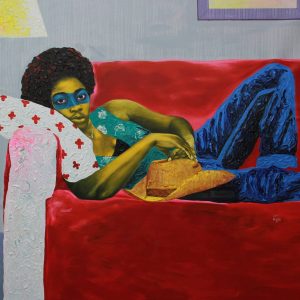
A moody seascape in deep indigo and pewter can make a white room feel contemplative. An abstract canvas in warm ochre and burnt sienna can make a cool gray room feel alive. The art does work that the walls, by themselves, cannot.
This is why choosing art by color first can be a great way to set the tone for a room. It lets you precisely tune the emotional register of a room, in service of how the space will actually feel to live in.
When in doubt, this is our color hack: If a room is complete but still feels flat, try adding a piece of art that introduces a contrasting accent color. A warm room (taupes, creams, oak) will often spring to life with a single canvas that brings in a cool element: deep teal, dusty blue, or sage. The contrast creates tension, and tension creates interest.
Room by Room: Setting the Mood with Color
Different rooms have different jobs. The art you choose and the color it carries should reflect the emotional function of the space.
Living room: warmth that invites conversation. This is where connection happens. Earthy tones, warm neutrals, and abstract works with amber, rust, or terracotta keep energy alive without overstimulating.
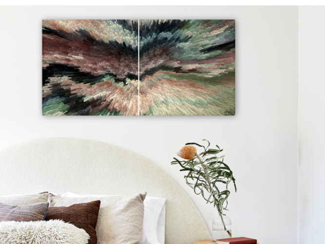
Bedroom: calm above everything else. This is the one room where psychology should always win over trends. Blues, blue-greens, dusty mauves, and soft neutrals in art support rest. This may not be the best place for high-contrast or high-vibrancy works.
Home office: focus without sterility. You need enough stimulation to stay engaged, not so much that it fragments your attention. Art with structure and pared-back color—architectural landscapes, restrained abstract works, greens—supports concentration.
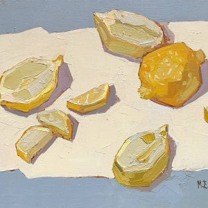
Kitchen and dining: appetite and energy. Warmth earns its keep here. Yellow, amber, red-orange, and rich botanical greens make food look better, and conversations linger. This is one place where a bolder, more saturated piece of art pays off.